aiuxdesign.guide · my own product
From a folder on my laptop to production.
A free AI UX audit built on 38 patterns, each one a working example rather than a picture of one. Nothing here was planned. Every turn came from a gap I hit myself, then checked against other people.
- Role
- Designed, built and ships it
- Scope
- Product, design system, front and back end
- Stack
- Next.js, TypeScript, Postgres, Vercel
- Status
- Live at aiuxdesign.guide

Nowhere to look
I was designing for AI, with AI, and I wanted to know how other people were solving the same problems. There was no good answer. Figma templates and Dribbble shots show you what an AI product looks like: the polish, the gradient, the imagined screen. None of them show you how the thing behaves when the model is uncertain, or wrong, or slow.
So I made a folder called aiuxdesignpatterns and started saving screenshots of real shipped products. That was the whole thing for a while. Eventually it seemed worth putting somewhere other than my own machine, so it went on GitHub and onto Vercel.
The reference I wanted didn’t exist, so the first version of this was just me keeping notes.
The demo that changed what it was
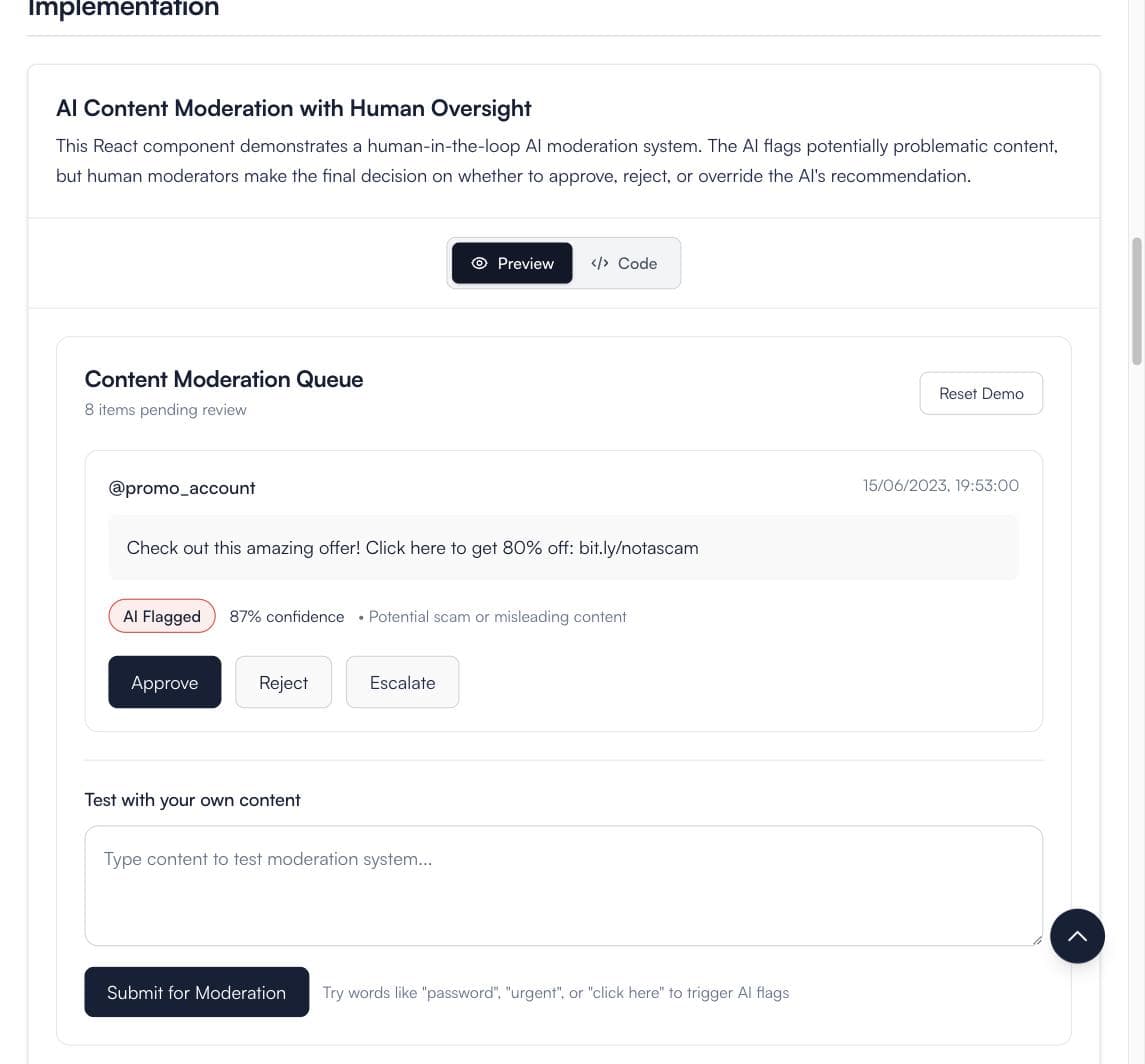
Looking at the Human-in-the-Loop page, I realised a screenshot still wasn’t enough. You cannot tell from a static image what happens when a reviewer disagrees with the model. So I built a small working version and put it under the screenshots, for my own reference.
That was the turn. A working example answers the question a screenshot leaves open, and if it helped me it would help the next person arriving with the same question. Every pattern got one. Thirty-eight patterns, each with a live micro-app, the code behind it, and an honest account of when the pattern is the wrong choice.
Then an engineering problem
Writing about the patterns on Medium showed me people were actively looking for this. That raised a harder question: if 38 patterns describe what good looks like, could one system read any interface against all of them and say something genuinely useful?
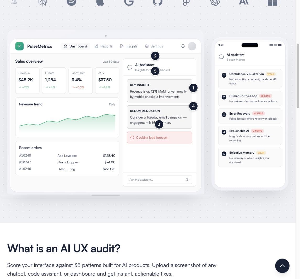
The audit tool is where I went to find out. Upload a screenshot, and it works out what kind of surface it is, checks it against the patterns that actually apply, and returns the gaps with the evidence for each one. Free, and no signup, which is still the thing none of the alternatives offer.
- 1
It evaluates, it does not learn
Each audit is independent. Nothing carries over between runs, and no signal adjusts the model. This is an evaluation harness, not a system that improves itself.
- 2
A critic stage, built and held back
A second pass judges each finding against a quality rubric (keep, sharpen or drop, and whether the evidence is actually visible in the screenshot). A revision step then fixes what it flags, inside a 55-second budget so it cannot run past the timeout.
- 3
Off in production, deliberately
The loop sits behind a flag that is switched off. It costs latency on a free tool and I have not proven it earns that. What users get today is the single analysis pass.
Twice I asked, twice I changed direction
I ran a survey asking what would make the site more useful. Over 60% wanted something that closed the gap between design and engineering, not more patterns. So I wrote guides. There are eight now, and the two people stay longest in, three to four hours, are Claude Code for Designers and Building Conversational UI.
A later survey said something different: people wanted help turning all of this into Claude skills they could actually use while working. So every pattern now downloads as one. That is the current headline, and it is the third thing this product has been.
I have changed the front door twice, and both times because I asked and the answer wasn’t what I expected.
The number that was wrong
When I made the audit the front door, I gated the decision on data rather than on how it felt. Then the funnel read badly. In one fortnight, only a sixth of people who picked a product type got a useful result back. I concluded people were uploading the wrong kind of screenshot and started designing fixes for that.
Before building them, I grouped the sessions by IP hash. Six of the seven were me: my own testing across two Macs and three Windows browsers. One row was a real person, and for that person the tool had worked on the first try, with the maximum number of images.
There was no quality problem. There was one real user in fourteen days. The bottleneck was not the product at all, it was that almost nobody had arrived yet. Every fix I had been about to build would have addressed a failure that did not exist.
- 1
What I changed
A test-mode flag so my own sessions tag themselves, and a standing rule: no conclusion from this table without first asking whether the rows are real users or me.
- 2
What it cost
Two weeks of reading a metric that was mostly my own reflection, and one fully-argued diagnosis that was wrong from the first line.
- 3
What it was worth
When the traffic did arrive, the same funnel showed 85% of real completions returning useful gaps. The product had been fine the whole time.
The leak I did find
Once there were real users, one drop dominated everything: of the people who watched the demo on the homepage, only about a fifth went on to start an audit of their own. Everything downstream of that click was healthy . Most people who started, finished, and most who finished got useful results.
My first theory was that the interactive demo was satisfying people instead of converting them. The data said no: only 14% of viewers ever clicked one of its hotspots, and non-converters were leaving without touching it at all. The decision was happening above the fold, before the demo mattered. Which also told me the demo itself was doing far less work than its complexity deserved.
The thing I built most carefully turned out to be the thing almost nobody touched.
I did not then run an A/B test, because at this traffic a realistic improvement would take about fourteen weeks to reach significance. Instead I pre-registered what would count as a win before changing anything, and measured before and after against that bar.
Where it stands
It is live, it is free, and it gets found without me doing anything: organic search, plus a steady trickle of people arriving from ChatGPT, Perplexity, Claude and Gemini citing it in their answers. That last part I did not plan and cannot take credit for designing.
Built
- 38 patterns, each with a working micro-app and its source
- Free screenshot audit, no signup, no account
- Self-critiquing evaluation harness (behind a flag)
- Eight guides, the longest holding attention for hours
- Every pattern downloadable as a Claude skill
- Analytics and a database read I actually check
- Daily AI UX news, sourced and deduplicated
Scoped, and next
- Widening the demo-to-start drop, the known open leak
- An email capture that captures anything at all
- Enough traffic to run a properly powered test
Every figure here is a dated reading from a specific window, not a running total. Two of the readings quoted were later corrected, which is the subject of section 05. The site is live if you want to check any of it.